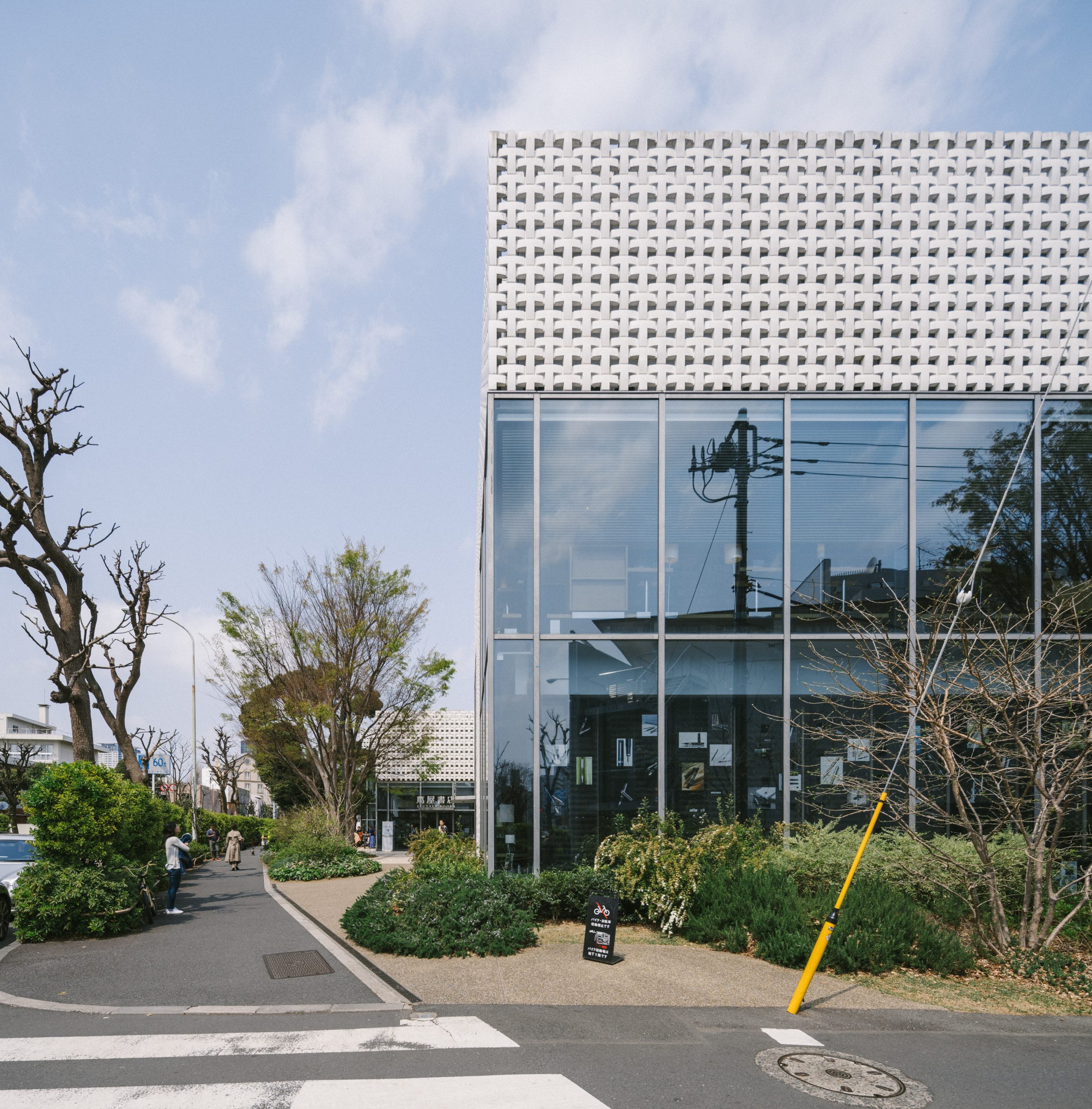
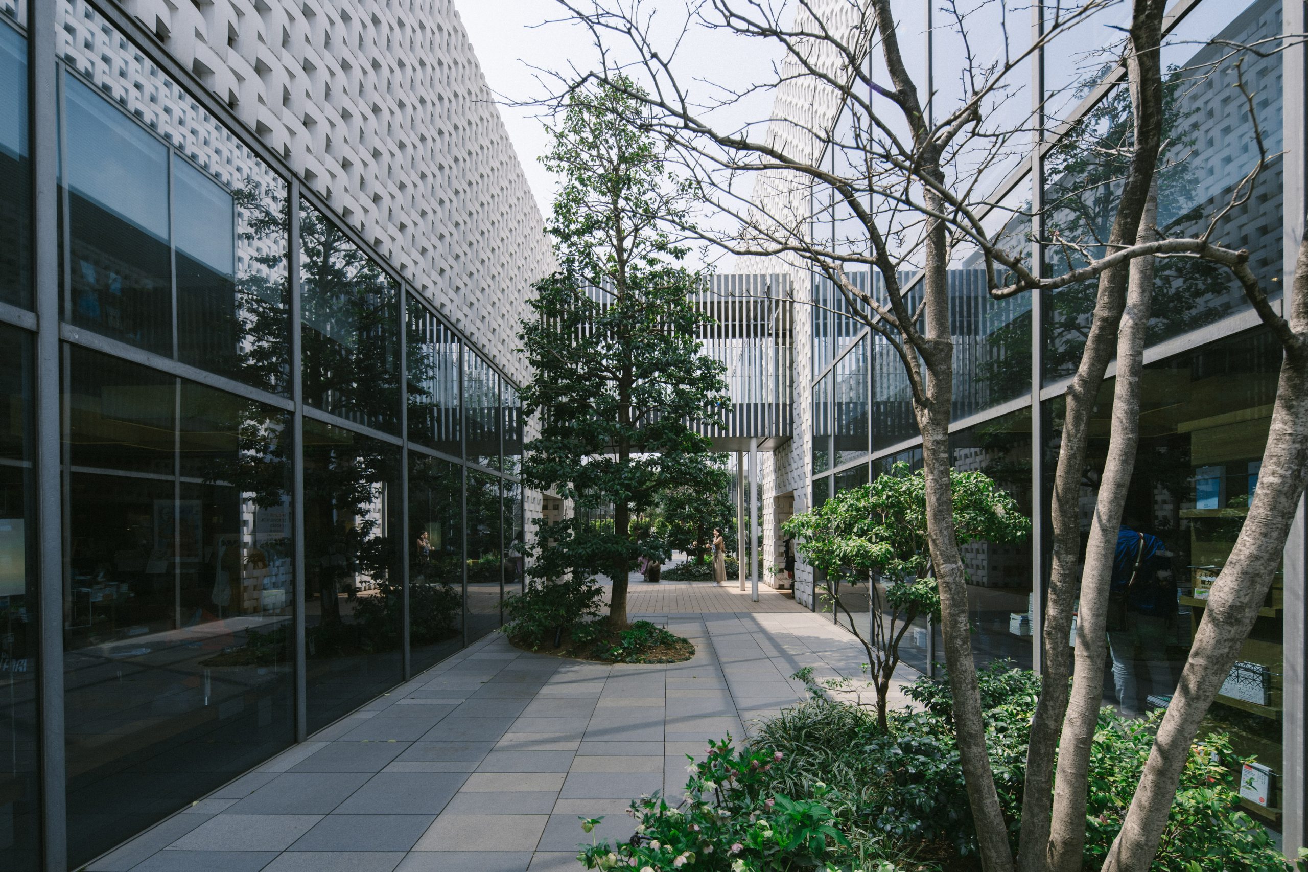
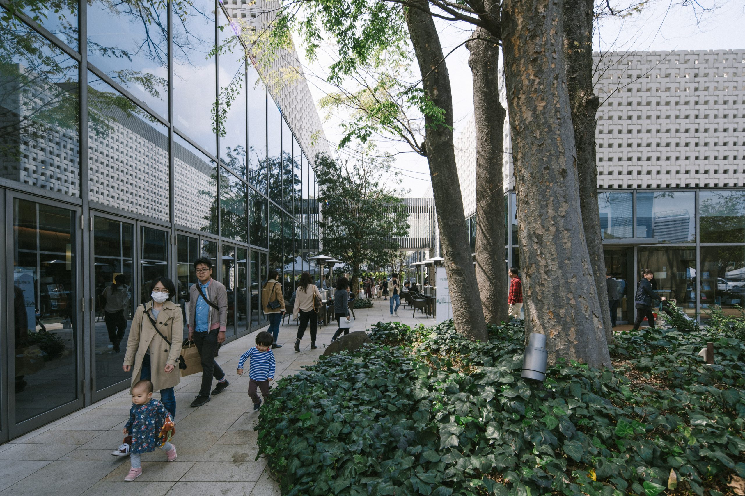
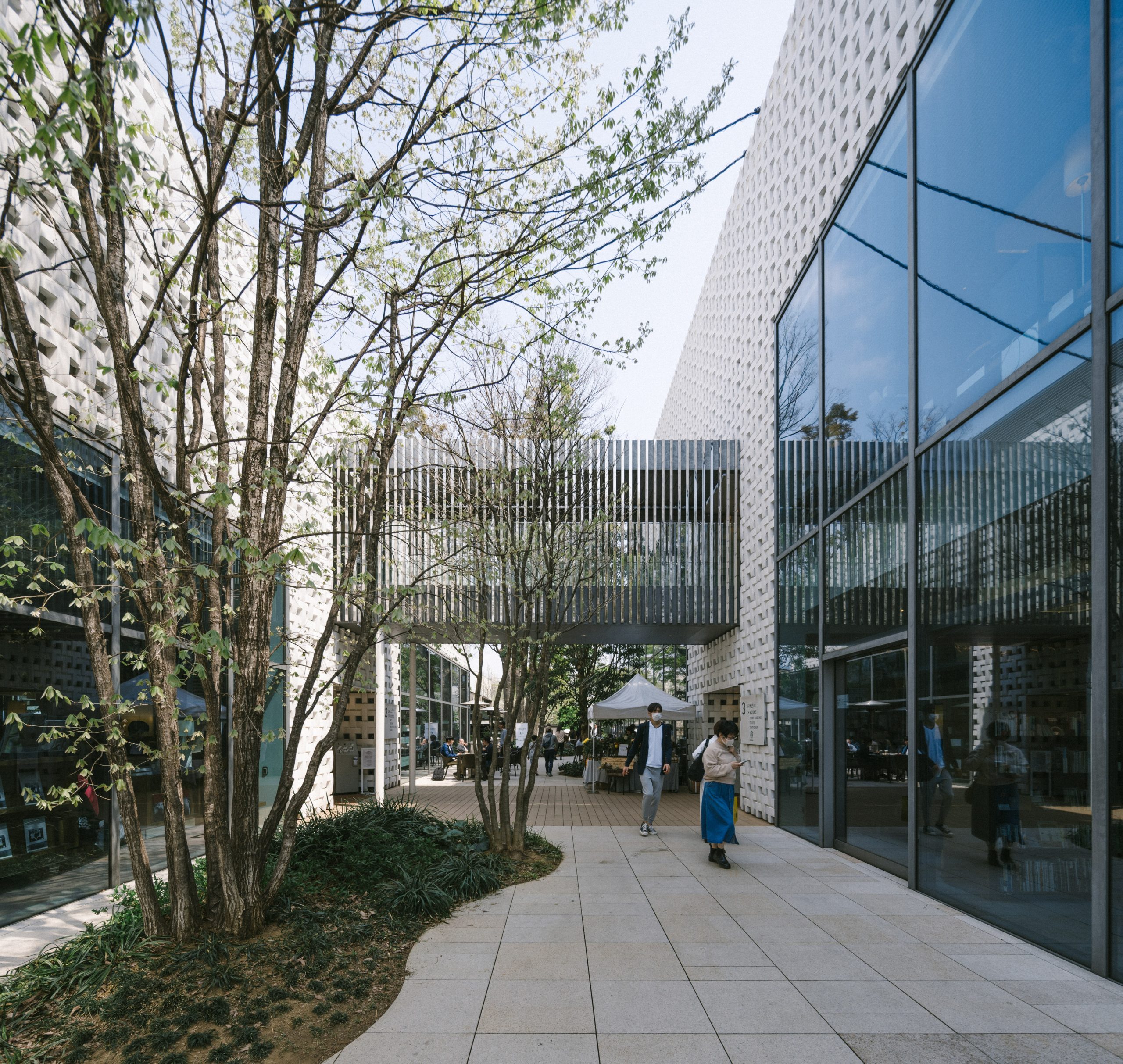
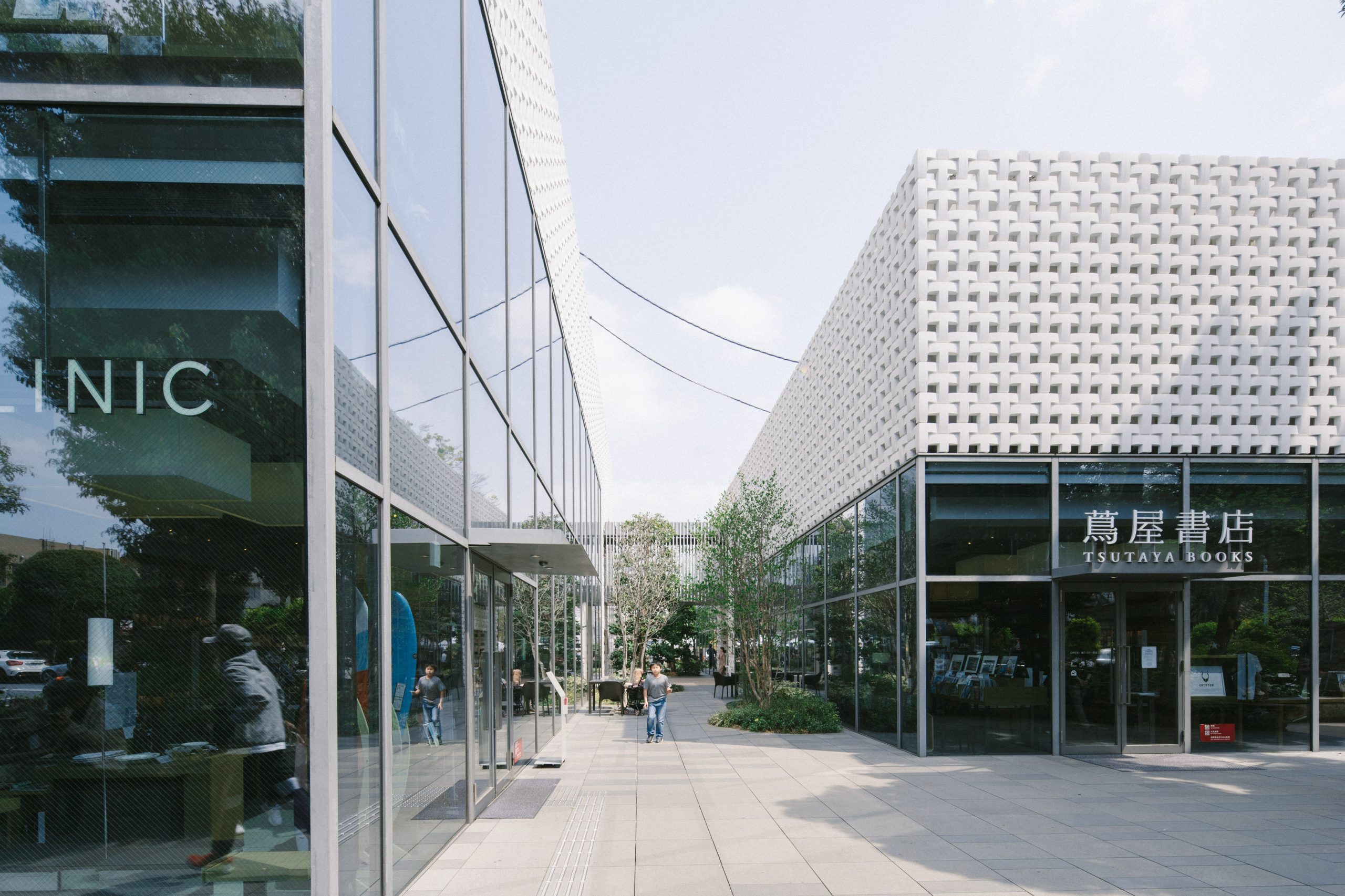
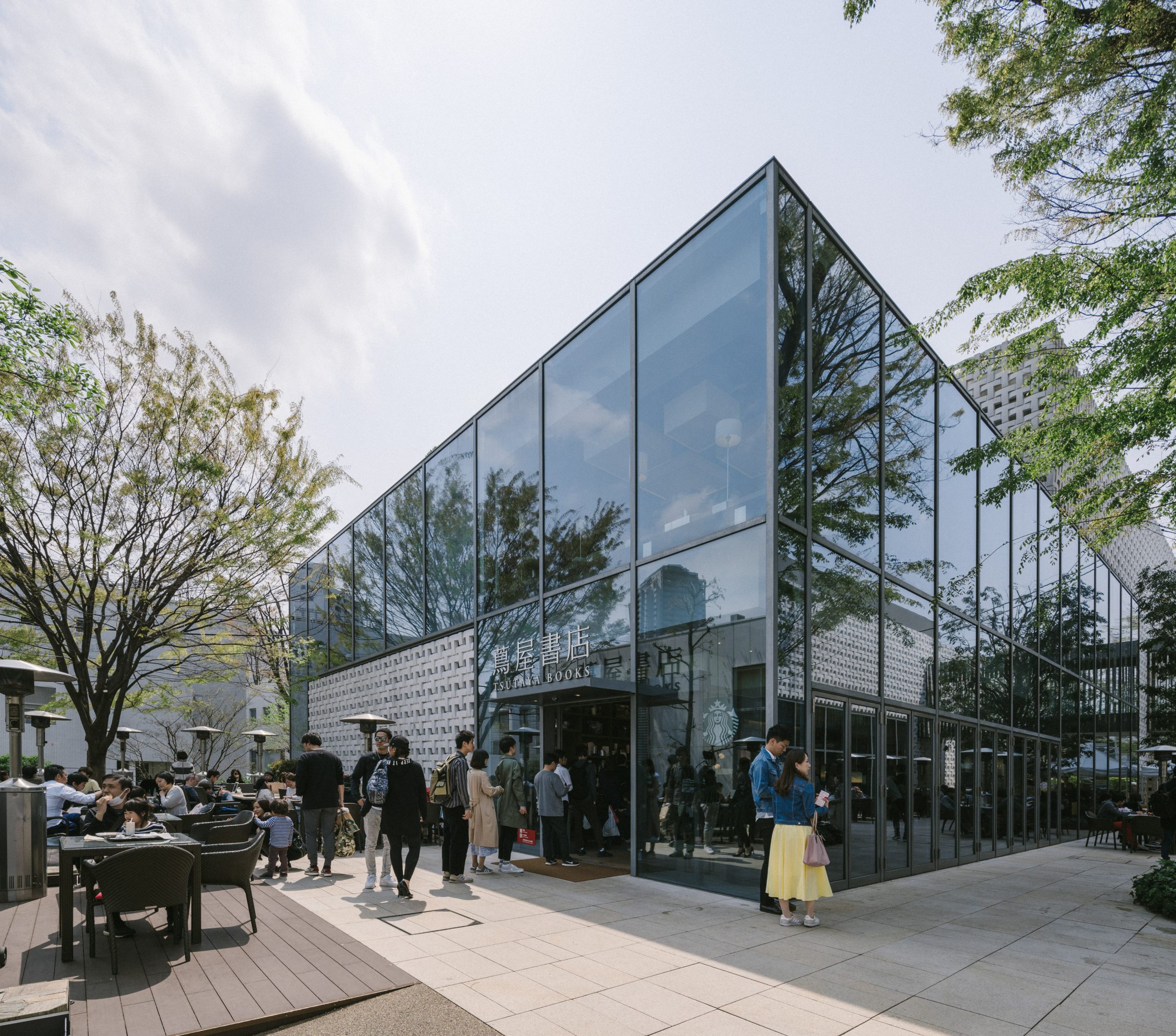
The T-SITE building facade in Daikanyama shows the capital T when viewed from away. This is a unique attempt at dual branding. The T-shaped design not only echoes the name of the store, but also resembles a bird’s nest and a beehive, just like an organic matter that grows in nature, yet blends in discreetly. This creativity is not to put a logo on the building, but to let the building itself become the corporate logo.